Monday, 21 November 2011

Novice-to-expert scale

The novice-to-expert scale is used to rate the ability of a creative person in terms of how they go about solving a creative problem. The scale is divided into five sections, which are:
·                     Knowledge
·                     Standard of work
·                     Autonomy
·                     Coping with complexity
·                     Perception of context
These stages are then all ranked using five novice-to-expert scale levels, these being:
·                     Novice
·                     Beginner
·                     Competent
·                     Proficient
·                     Expert
The more criteria you are able to meet, the closer you get from changing from a novice to an expert.

The Novice-to-Expert scale
I currently consider myself to be a beginner within my creative area of photography, as my skills still need major development in order for me to be considered an expert. In terms of my knowledge, I have minimal knowledge, but unlike a novice, I am able to connect some of this to my chosen practice. When it comes to my standard of work, I have learnt though completing my Foundation Diploma in Art, Design and Media, how to start being an independent learner, unlike a novice who would need supervision. Due to my Foundation Diploma, I would also rate myself as "competent" for the Autonomy section, as I have learnt how to use my own judgement to achieve a task. However, I still rely on the advice from lecturers and other creative people around me for advice, so I haven't yet taken full responsibility for my work, which is why I'm not proficient in the Autonomy section. When it comes to the "coping with complexity", I currently consider myself to a beginner because even though I have had to deal with some complex issues with my work, such as how to develop it and how I should go about creative it. I am able to overcome this complexity with some analysis and planning, but not enough to make me proficient at it. For the final stage, perceptions of context, I would say I am competent because I am able to see how my actions, such as my research and experimentation, will have an impact on my final outcome. However, I don't always see the complete picture like I would if I was an expert.

My position on the novice-to-expert scale should dramatically change over the next three years because I am studying for a degree in Visual communication. Over these next few years, I will be introduced to be new photography processes, increasing both my knowledge and understanding. The way I approach a creative problem will change, and I will be much better at working independently and taking responsibility for what I produce.

The Experts

As creative people, our inspiration comes from a variety of different sources. It is this variety that not only affects what our work is about, but also our creative style. Possible sources of inspiration our environment, collections and history. One of the best sources for inspiration are existing creative experts. These may be current, modern artists or artists from a different century. We are mostly inspired by artists who we like because we take the elements of work that we like, and interpret them in our individual creative style.

Vault 49 Fiesta advertisement (2011). Available at: http://www.vault49.com.
Accessed on 11th January 2012
            As a visual communicator, I have, and still am developing skills in a number if creative disciplines. This is because I believe that combining disciplines can strengthen creative outcomes and make the work appeal to a wider audience. Even though the majority of my creative skills are in photography, and the how I usually create my artwork, I also like to create illustrations, as well as combine my photography with graphics. Vault 49 is a design company who I often look at for inspiration because they also like to work in this way. Vault 49 is based in New York, and employs a number of graphic designers, illustrators, photographers and animators, as well as 3D and fine artists. One strength of having such a diverse team to work on one project is that they will all start with ideas that are different ideas from each other, meaning that they have a wider choice for a creative outcome. Also, they all have very different skill, so combining them can only increase the success of the work they produce. Each member of the team will also learn new skills and creative ways of thinking from the people they are working with. Their portfolios consist of a combination of 3D sets, type, illustration, product design and advertising, working for large organisations/companies like 02, Fiesta, New York University and Barclays.

Monday, 14 November 2011

Story Development-Three act structure

The three act structure is a structure used in all books and films. As it is a simple structure, it is very diverse, which is why it applies to all books and films, not just some or most. The three acts are the beginning, middle and end. Throughout these three acts, the story follows a protagonist, also known as the main character. Every story, whether it's from a book or film, needs to have a protagonist because it is the reader's/viewer's way in.

In the beginning stage of this structure, all the characters start in a state of equilibrium, including the protagonist. During this stage, the characters and the story/plot are established.

This is then followed by the middle, or crisis phase. Something happens at this point in the film which disrupts the equilibrium. Common themes in films which cause a crisis are death, war, political issues, a missing/lost character, a crime being committed etc.

The 3 act structure. A screenplay approach
(2011). Available at:
 http://robsanderswrites.blogspot.com/2011/01/screenplay-approach.html.
(Accessed on 11th January 2012)
The final stage, also known as the end, is where this crisis is resolved. How this problem from the middle of the story is resolved is dependent on the crisis, which forms the plot. By the end of the film, the characters are usually back in a state of equilibrium. However, this state of equilibrium is very different to that at the beginning of the film/story.  In an average two hour film, the beginning stage usually lasts for around 30 minutes, as well as the end. The middle stage however is usually around an hour long, as this is the most important part of the film.

It was believed for many years that the order of the three act structure is always the beginning first, followed by the middle and then the end, but this isn't the case. For example, some episodes of CSI: Crime Scene Investigation, starts with showing the ending, and then pieces the picture together through the 45minutes to show how the ending came about. The Green Mile is another example of this, stating with an old man in a care home telling his friend about his past.

Story development- The hero's journey

The hero's story is also known as the monomyth, and is a term created by Joseph Campbell (1949) in "The hero with a thousand faces" In a similar way to the three act structure, Campbell believed there were three stages to a hero's journey in both films and books; the departure, initiation and return. These three stages are divided up further to create a total of 17 stages of the monomyth.

The first stage of the hero's journey, known as the departure stage, is divided into five further sections:
1. The call to adventure-The hero starts his journey in a state of normality, and then receives information of some sort that causes a problem that will send him/her on an adventure.
2. Refusal of the call-After getting the call to adventure, the hero is reluctant to go. This could be for a number of reasons, including s/he doesn't think the call is important.
3. Supernatural aid-The hero accepts the challenge and is provided with help of some sort to make him/her stronger, wiser etc. than before so they can face this challenge.
4. Crossing the first threshold-The hero starts his/her adventure and is no longer able to turn back.
5. The belly of the whale- The hero is in danger.

The second stage in the hero's journey in a film (or book) is called the initiation stage, which consists of six smaller stages:
1. The road of trials-The hero faces a number of trials where he much achieve success in order to complete his journey.
The Hero's journey. Available at:
 
http://www.esotericonline.net/profiles/blogs/the-hero-s-journey. 
(Accessed on 11th January 2012)
2. The meeting with the Goddess-The hero meets a mystical or supernatural female who he develops a bond with.
3. Temptation away from the true path- Temptation is presented to the hero that would cause him to fail his journey/mission. This temptation is very often a woman.
4. Atonement with the father-The hero faces a "father-figure" which must be defeated. This father-figure could be a person of high authority or something symbolic.
5. Apotheosis- The hero achieves a higher place after successfully completing the trials he has currently faced.
6. The ultimate boon- This is when the hero has overcome all of his trials and the mission of the journey has been completed. This usually happens after defeating the villain.

The third and final stage is called the return stage, made up of six smaller sections:
1. Refusal of the return- The hero wants to stay in the place where he has reached the ultimate boon.
2. The magic flight- Taking the treasure from the ultimate boon with him, the hero returns home.
3. Rescue from without- The hero is saved from danger or a threat whilst on his way home, usually by an unexpected source.
4. crossing the return threshold-The hero returns home and is no longer in danger.
5. Master of the two worlds- The hero becomes master of the domestic and alien world now that he has successfully completed all of his challenges.
6. Freedom to live- The hero can now live as he chooses because he has conquered the demons/evil which created the call to adventure.

Unlike with the three act structure, not all stages of the hero's journey in accordance the Campbell's theory is present in every film or book, as some are missed out However, they are the only possible stages for the hero's journey, so no matter what film/book the hero is present in, some of these stages will be present.

Monday, 7 November 2011

Interpretation

Disney's Alice in Wonderland (1951).
 Image available at: 
http://johoffberg.com/tag/alice-in-wonderland/.
(Accessed on 11th January 2012)
It's not only your ideas that influence your final creative outcome/s, but also how you interpret those ideas. Interpretation is about how you convey the meaning of, explain or translate something. Even with the same idea, different people will interpret this idea in a different way. These interpretations could be very similar, or completely different. There are many factors effecting how someone interprets a creative idea, including their inspiration, their creative pathway e.g. photographer, graphic designer, painter etc. and the historical content of their work. The creative pathway someone takes will not only have limitations, but also advantages, which is why it has an impact on interpretation. Historical content also plays a large part in interpretation because artists want their work to be current, relevant and reflective of the time.

Tim Burton's Alice in Wonderland (2010).
Available at:
 
ttp://theblogpaper.co.uk/article/film/26feb10/tim-burtons-alice-wonderland
 (Accessed on 11th January 2012)
            One example of how the interpretation of an idea can influence a final outcome is with the story of "Alice in Wonderland". There are many visual versions of this story, with the most popular being illustrations, films and animations. When Walt Disney created their animation of Alice in Wonderland in 1951, their interpretation of Alice was very different from previous work, such as that of Arthur Rackham (1907) who had a slightly realistic approach and mimicked the Edwardian period. The introduction of colour and sound influenced a new image for Alice that was unlike anything produced before. Walt Disney gave Alice an English accent, as well as a softer, innocent, more child-like appearance. This is very different from Tim Burton's 2010 adaptation, where he used an exaggeration of the characters to create a much darker atmosphere.

Delivery

How a creative person delivers a final design to a client will depend on what platform it is required for, as all platforms have their individual requirements and limitations that have to be taken into consideration.

The designer/photographer had to take the size and scale of the billboard
 into consideration when creating this advertisement otherwise there would too
much white space or some of the people would be cut off.
            There are a number of platforms for artwork, including editorial, online, advertising and branding, textiles and fashion, installation and interventions. All of these have different requirements, limitations and design specifications due to the variety of clients and target audiences. It is important to remember that clients and target audiences are sometimes different. If an illustrator has been commissioned to create work for a children’s magazine, then magazine is the client, but the children who the magazine is aimed at is the target audience.

            Different platforms can have a variety of different challenges. For examples, billboards are a form of large scale advertising. One problem an illustrator often faces with creating work for billboards is ensuring any typography they create and use is legible, especially from a long distance. Another example of this is a graphic designer who has to create a logo. If the logo is for a billboard advertisement which has a slogan with it, the slogan could be made visible by increasing the slogan size. However, if this logo also had to be used for a phone app, the logo would be much smaller and therefore the slogan wouldn't be legible due to the small surface area for it to fill.

            It is important for the platform to be taken into consideration in order for a design to be delivered correctly. Delivery is key for the creative person, as this can be the deciding factor for whether or not you client uses your artwork. An inability to consider platforms can prevent someone from getting work in the future and furthering their career.

Monday, 31 October 2011

Tone of Voice

The tone of voice is the general character of your work. This is created through the images used and any text included. There is a tone of voice to all typography, which can create either a dark or soft atmosphere. The type tone needs to support the message, and work well with any images included. For example, the type on a poster promoting a horror film needs to have a dark tone. Using typography that looks scratchy and includes lots of angles and straight edges should help to make the dark tone that’s needed. It's not only what is said that influences the tone of voice.

Different colours change the tone of voice. 
(Picture available at: http://www.zetaprints.com/help/more-typography-tricks/)
            The colour of the type also has an impact on the tone of voice. This is just like how colour gels on lighting in a photography studio will have an impact on the tone and atmosphere of the photographs. Colours can symbolise, as well as fuel emotions. For example, red is associated with passion, love and anger, green is usually linked to jealousy, and white symbolises innocence and purity. These ideas behind colour and their meanings come from old literature and are still used today. Shakespeare was very well known for using colour to symbolise elements of each characters personality. It's not just the colour itself, but also the shade of the colour that impacts the tone of voice.

            The size of the typography also affects the tone of voice. When the type is large, it can be very dominating and loud. The largest typography is usually the most important, and is used to grab the attention of others e.g. the title on a poster is the largest piece of typography. Smaller typography doesn't have such a big impact. It can either be less relevant information and/or is more detailed.

            The audience that your work is aimed at will always have a big impact on tone of voice because it will determine what images you create, the style of these images and how simple they are, what text is included (if any) and what colours you use. For example, illustrations for a baby book will be less detailed and have softer colours than illustrations for a comic book because the it is aimed at a younger age group.

Legibility (Critical commentary)

Legibility is an important factor to consider when creating any design that involves text. These could be illustrations, posters, magazines etc. If something is legible, then it is easy to read. It's important because the text work together with and supports the image; therefore, people need to be able to read it. There are several factors that affect legibility.
This page from my sketchbook shows my experimentation of typography.
Legibility was a key factor to consider when choosing which would be used
for a magazine logo.

            The typefaces you choose effect both the legibility and tone of your work. Typefaces are a style or design of type, and they don't need to be clean cut for it to be legible. Some typefaces are more legible when they are bigger because they are more spaced out and their outlines are clearer to see.

            The colour you choose for your type can either improve or reduce text legibility. Using colours that contrast each other for either the text and the background, or the text and its outline, will improve legibility because the colours stand out amongst each other. This is why Microsoft Word automatically uses black text on a white background (unless you decide to change it). Black and yellow are the best colours to use together to improve text legibility because they have the highest contrast. This is why hazard signs use these two colours. Using colours with a low contrast will reduce text legibility. White and yellow are very rarely used together, especially in design, because there is very little contrast between them.

            Many people find it hard to read a large block of text and remember what it said, which is why alignment and layout is so important. Using paragraphs and indents will improve legibility because it breaks the text up. It is much easier to read and remember several pieces of small information than one large piece of information. Using columns can also have the same effect, which is why newspapers use them. Just like using paragraphs, adding pictures will also help to break up the text, improving its legibility.

            Improving legibility not only effects how easy text is to read, but also how easy information is to find. For example, website forms often use colours and layout to make it easier for people to be able to fill them in.

Monday, 24 October 2011

Where do creative people get their ideas from?

Creative people all produce different ideas from each other, even to the same creative problem. This is because the places where they get their inspiration from are usually similar, if not the same. People are influenced by factors like their working environment, culture, tradition, books, existing artists/artwork, music, films, theatre and history

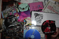
I collect C.D.s because I take inspiration
from album artwork.
            Collections are always a good source for inspiration because they are individual to the person who collects them. They display unique characteristics between items that are the same. For example, a collection of music records are all of the same form, but the artwork and musical content vary.

            Sketchbooks are also a good source for inspiration. This may be one of your own previous sketchbooks or somebody else’s. Looking back at past projects can inspire options for current work, not only with the possible project pathways, but also research choices, media options, previous successful and failed experiments, as well as development options. Sketchbooks belonging to other creative people can be just as useful as your own sketchbooks because people work in different ways. Learning to take a different approach to a creative problem will result in a more unique outcome. Taking inspiration from the work of others will help you to be more open minded, resulting in a wider experimentation of materials and diverse outcomes.

Graffiti art in Bristol City Centre,
created after the death of Amy
Winehouse
            Both fictional and non-fictional books can be helpful. Fictional books help to fuel the imagination because you visualize the story in your mind. These visual images can then be used as starting points for your ideas. Non-fiction books are not only good for visual sources, but also research. Extensive research is vital and is an intrinsic aspect of the design process. It causes you to have a deeper understanding of your project theme, generating more ideas. Research is also important in case your designs need to be factually correct. For example, if you were commissioned to design an educational poster about global warming, you would need to make sure any facts that you put on it were right.

            No matter what kind of artist you are, or who your work is made for, the best way to make sure you are always inspired is though constant inquiry. Inspiration can come from anywhere, so you need to be open minded. 

Research

Research is a key aspect of trying to solve any creative problem, and is usually the best starting point, as well as being helpful for aiding the development and improvement of your ideas. Carrying out research involves extensively investigating something. With creative problems, the main three pathways of research for artists and designers are your target audience, your project theme and existing work (e.g. existing festival posters if your brief is to design and make a festival poster).

I researched the building bugs on the boards
outside New Street Station (Birmingham UK)
for a project about Birmingham's architecture.
This is a form  of primary research.
There are two types of research, primary research and secondary research. Primary research is when you create a collection of information that doesn't currently exist as a collection. This involves collecting data first-hand. It can include experiments, questionnaires, surveys, interviews, tests etc. One advantage of primary research is that it doesn't rely on other peoples interpretations of data, making it more reliable. Also, the results respond to your research needs, rather than secondary research where you have to separate the useful information from the useless information. Depending on what you are researching, you may need information that is up to date, rather than information that is no longer relevant. Despite this, primary research can be very time consuming. If you are carrying out a questionnaire, you first need to write the questions, give them to people and wait for them to give them back, and then interpret the results. Primary research can also be very expensive, like a scientist carrying out an investigation.

Secondary research I carried out, looking at 
existing  magazines .
Secondary research is research that already exists, as it is primary research that somebody else has already carried out. Sources of secondary research include magazines, books, the internet and statistics. Unlike primary research, secondary research is much cheaper because all you need is access to an information source e.g. books and the internet in a library. It can be less time consuming because you don't have to collect the data and interpret it yourself. However, it will take a lot longer for you to divide the information you need from everything else. Also, you never know how reliable your sources are. This is one of the biggest problems with information on the internet. Anyone can make a website and lie about something they don't fully understand, or pass their bias opinion off as fact, so it is very important to check your findings with other sources or your own primary research. Also, you have to be very aware of plagiarism, meaning you need to reference all your sources of information due to copyright laws.

Extensive research is very important for any creative problem. Even though both primary and secondary research has its disadvantages, by using both, you are more likely to overcome these problems. Where one research type has a disadvantage, the other has an advantage to overcome this.

Monday, 17 October 2011

Pastiche, Synchronicity and Conceptual Appropriation

Artists often have elements of their work that are similar or mimic that of another artist. It is not usually considered plagiarism, but is it pastiche, synchronicity or conceptual appropriation?

Pastiche is when an artist creates a piece of work that is like an already existing piece of art, whether it imitates another artist or an artistic time period. One example of this is Casper David Friedrich's “Chalk cliffs on Rugen" (1818). The idea of someone stood on a rocky cliff, as well as the style of clothing of the man involved and the surrounding scenery has been imitated in Cliff Richard's "Heathcliff" (1996) album cover, as well as in David Tennet's "RSC Hamlet" (2009) poster.

Synchronicity describes the relationship, or synchronisation between two or more ideas. Even though these ideas mimic each other, they are related by chance, and is not someone stealing an idea from someone or something else. In art and design, this is when two or more artists/designers produce work with synchronised ideas, without knowing of each other’s worker. They couldn't have created their work with intent to copy from someone else, so this relationship between their ideas is only coincidental. One example of this is Gillian Wearing's work, "signs that say what you want them to say and not signs that say what someone else wants you to say" (2006). Volkswagen used the idea of people holding signs for one of their promotional campaigns, and even though they weren't aware of Gillian Wearing's work, she threatened to sue them for plagiarism. The situation was later settled out of court.
           
Esquire 1969. Artsy time-best magazine 

covers (2009). Available at:
(Accessed on 11th January 2012) 

Conceptual appropriation is a technique that many modern artists use. It means to "take possession of something", and is when an artist purposely copies an existing image, but changes it slightly to put their own twist on it. For example, Esquire magazine had a cover with Andy Warhol's Campbell's soup. However, unlike the original, artwork, this image has the soup can open with Warhol drowning in the soup. The purpose is not to copy or steal the original artwork, but is instead to "borrow" it. The artist wants viewers to recognise that part of the idea has been taken from another art piece. Conceptual appropriation is usually used by artists either to make fun of existing work, like Banksy often does is his work, or to make a point.

Notions of originality

The work that creative people produce needs to involve original ideas for it to abide by copywrite laws. Due to the Copywrite Act 1988, it is illegal to use someone else’s work, including their ideas, without consent until 70 years after the creator's (writer, musician, artist etc.) death. Even though it sounds very simple, problems easily arise because of where our ideas come from. We are inspired by everything around us, including other people's work. The world around us, including music, books, films and theatre all play an important role in aiding creative minds and artistic ideas. We take inspiration from them, which will be evident in our work. However, this arises the question, "where do we draw the line between taking inspiration from someone else’s work, and simply stealing their idea?"

E.T. film poster (2010). Available at: http://workinprogress27.wordpress.com/.
(Accessed on 11th January 2012)
Before the 1850s, most artwork was created for private collections, such as royalty. Therefore, artists before this time were very unlikely to take inspiration from existing artwork. However, now that art is displayed in galleries and museums, as well as in society like posters and album covers, it is much easier to find inspiration, as well as to copy existing artwork. If your taking inspiration from somebody else’s work in order to create your own, is your art still original, or are you simply copying someone else’s idea? For example, the DVD cover for E.T shows two fingers touching, and it is clear that inspiration had been taken from Michelangelo’s work on the ceiling of the Sistine Chapel, when God and Adam's index fingers are touching. However, even though the idea of the touching fingers is the same, the E.T DVD cover has an alien and a boy. It also has a completely different background, the method used to create them is very different, the styles of both images are not alike and the purposes of them are completely different. Therefore, are the similarities there because inspiration is taken from one piece in order to create another, or is this copying?
                                                       
            The argument could then arise that if an artist has used elements of another person's work, but put their own personal stamp on it, then the art is original because it only mimics parts of an existing piece, and is not an exact replica. Damian Hurst gets a lot of criticism for his work for this reason. His sculpture of the scientific model of the human body was not his idea, and he didn't make the work himself, but it was his idea to make it on a much larger scale than the first models. Is this Hurst’s piece an original piece of art, or idea stolen from someone else?

Monday, 10 October 2011

Managing a creative environment

Creative people need to have a creative environment, not only for a place to work, but also where their ideas can grow and develop. Even though our ideas are produced in our brain, there are more factors responsible for our ideas than just our brains. This is because we are influenced by the world around us. Factors like our working environment, culture and personal interests are all very important for our creation and development of our ideas. For example, varieties and traditions within culture can stimulate each person's mind in a different way, resulting in a variety of unique and diverse ideas. It is for this reason that it is important to have a successful working environment. By surrounding yourself with the tools of your profession, such as pencils for an illustrator and lenses for a photographer, you are allowing yourself to be reminded of the creative possibilities you have, as well as the limitations. Both the possibilities and limitations will affect what ideas you think of, as well as the ways you try to overcome the limitations/problems you face. A creative environment can also influence how open minded you become, resulting in you taking a different approach to your work than other designers would, making your work.

My creative working environment
By forming collections of thing, no matter what you choose to collect and surrounding yourself with those in your creative working environment can also greatly benefit your work. For example Mel Milton, the creator of Pixar, covers the walls in his working environment with drawings of the characters he has created. This is so he can take inspiration from his previous work when creating characters for a new animation. He is able to see what factors from previous characters were successful and could be adjusted for a new character, whilst all being able to see if his new ideas are too similar to his previous work.

A lot of the inspiration and ideas I produce are inspired by the artwork on and inside C.D. covers. Most of the booklets inside C.D. cases contain a mixture of photography, graphics and illustration and work together to communicate a visual representation of the music and musician/s. I find the combination of these ways of creative ways of working important for my own work because I think that only using one medium will limit the possible visual outcomes.

Restating problems

When designing a magazine page 
about Curzon Station, I had to 
experiment with several text layouts 
until I created one that was
successful
Visual problems need to be answered in an interesting way in order for the response, or outcome, to be successful. By restating the problem, or redefining it, you are more likely to approach the problem/design brief in an interesting way, breaking the conventional design rules. This is important because the way you approach the creative problem will affect the final outcome, which needs to be unique and diverse, not only to increase your chances of being recognised as a creative practioner, but also to increase the chances of your client wanting to use your work. For example, a graphic designer who designs a website that has a very different layout to other websites is more likely to be remembered, therefore increasing his or her chances of getting more work in the future, as well as viewers liking his/her work because it breaks conventional design rules and is very different from what they're use to.

The most successful and easy way to ensure that you do approach a creative problem in an interesting way is to review you approach. By doing so you will give yourself a much wider choice of options, resulting is a larger probability of producing a unique idea. Make a list or mind map of as many ideas you can possibly think of, and then narrow down through experimentation and evaluation.

It is vital to your creative success that your work is original. Random triggers are very useful for helping you create original and unique ideas, even though they may not relate to your creative problem. Any word, image or experience can be a random trigger, and writing or sketching them for future reference can be very helpful.

Monday, 3 October 2011

Utilise your creative brain

One question that psychologists and scientists have tried to answer is "where do our ideas come from?" Even though we are inspired by the world around us, our ideas are formulated in our brain. The human brain is divided into two sides, the left side and the right side. Even though they are connected and work together, each side has different capabilities, making them responsible for different aspects of our thinking.

                The right side of the brain is responsible for our creative and imaginative nature. People, who have a more dominant right side, tend to more artistic than those with a dominant left side. This is because the left side has a child-like nature, as it's innocent, sensitive, experimental, playful, and curious. This playfulness is evident in Henry Moore's sketches. When exploring his ideas for possible sculptures, it's clear to see that he was thinking on the page due to the development of his drawings. Play also works closely with "accident" when developing creative ideas. This is because our ideas become viable when we sketch them out, and any accidents we make when drawing ideas help us to develop new ones. When sketching ideas, it is important that they aren't just doodles. This can be avoided be having a direction for our ideas to explore by having a general outcome for our sketches.
               
The left side of the brain is very different to the right side, and rather than being child-like, it works more like an accountant does. The left side is much organised, and concentrates on clarifying, quantifying, editing, selecting and classifying. Unlike how the right side works towards being playful, the left side asks the question, "What is useful?"
               
Image showing the two sides of the brain-
illustrator unknown-(2009). Available at : 
http://willamey.blogspot.com/2009/08/pantone-1293.html 
(Accessed 11th January 2012)
                Both sides of the brain are very important in our creative approach. This is because our right side will cause us to think of new ideas and approaches to a creative problem and the left side will then analyses and evaluate them to narrow down our possible successful outcomes. Our brain constantly switches between the modes of the right and left side of our brain as we need to constantly have to evaluate our ideas so we know we are heading towards the best possible outcome. By being consciously aware of which side of the brain we are using, we are able to make the most of our brain's capabilities.

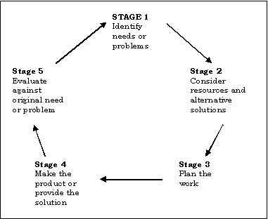
Cyclic Design process

Virginia Tech Digital Library and Archives
(2004). Available at
 http://scholar.lib.vt.edu/ejournals/JITE/v41n3/crossfield.html
(Accessed on 11th January 2012)
In order to have a successful creative outcome or solution to a visual problem, you have to go through a cyclic design process. This is a cycle which involves developing your ideas to produce the most successful possible outcome. The cycle initially starts by thinking of an idea or possible solution. You then have to plan how you could possibly make this idea become reality, thinking about the materials you will use, equipment you will need, what facilities you need to gain access too (e.g. a photography studio) etc. This will then lead you into the "do" part of the cycle, which is where you need to create the idea you have created for the visual problem. Once you have done this, it is very important to evaluate your produced idea. This is so you can make improvements and develop your ideas further; therefore ensuring your visual solution is the best it possibly can be. Every time you evaluate an idea, new questions emerge, which need to be answered in order to have a successful outcome. These questions are usually “can it work better?" and "can it look better?". The improvements and development you find from evaluating you work will then cause you to have to think about your ideas, therefore creating the cyclic design process.

                The number of times you have to go around this this cycle all depends on how strong your initial idea is. It also depends on the improvements you choose to make. Making intelligent improvements will reduce the number of times you have to go through the cyclic design process. Thomas Edison had to go through this process many times when creating the light bulb, as he designed over 10 000 prototypes before creating a working light bulb.