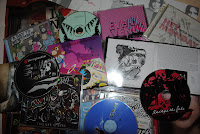
The tone of voice is the general character of your work. This is created through the images used and any text included. There is a tone of voice to all typography, which can create either a dark or soft atmosphere. The type tone needs to support the message, and work well with any images included. For example, the type on a poster promoting a horror film needs to have a dark tone. Using typography that looks scratchy and includes lots of angles and straight edges should help to make the dark tone that’s needed. It's not only what is said that influences the tone of voice.
 |
| Different colours change the tone of voice. (Picture available at: http://www.zetaprints.com/help/more-typography-tricks/) |
The size of the typography also affects the tone of voice. When the type is large, it can be very dominating and loud. The largest typography is usually the most important, and is used to grab the attention of others e.g. the title on a poster is the largest piece of typography. Smaller typography doesn't have such a big impact. It can either be less relevant information and/or is more detailed.
The audience that your work is aimed at will always have a big impact on tone of voice because it will determine what images you create, the style of these images and how simple they are, what text is included (if any) and what colours you use. For example, illustrations for a baby book will be less detailed and have softer colours than illustrations for a comic book because the it is aimed at a younger age group.


